Your website might be gorgeous. Award-worthy fonts, silky animations, a hero image that could make a stock-photo model weep with pride. And it might still be quietly costing you customers every single day. Because here's the thing nobody wants to hear: a beautiful website that doesn't convert is just very expensive digital art.
After reviewing hundreds of sites, we've noticed the same conversion-killing mistakes come up again and again — and the frustrating part is they're almost always fixable. Here are the big ones, and how to sort them out.
Mistake 1: Making Visitors Think Too Hard
When someone lands on your site, they should understand three things within about five seconds: what you offer, why it's for them, and what to do next. If your homepage headline is a clever pun that explains nothing, or your navigation is a labyrinth, people don't puzzle it out — they leave.
Clarity beats cleverness every time. Say what you do in plain language. Your visitors are busy, slightly distracted, and one tab away from a competitor. Make it easy for them.
Mistake 2: Hiding or Weakening Your Call-to-Action
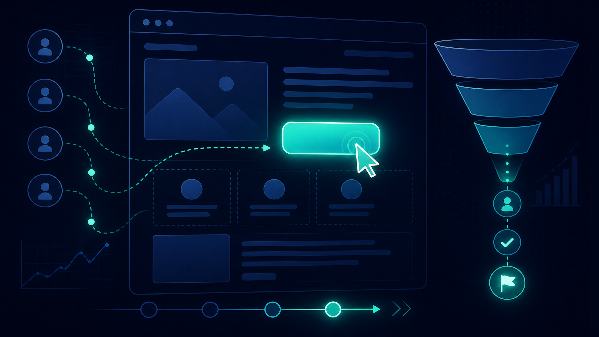
Your call-to-action (CTA) is the whole point of the page. Yet so many sites bury it below the fold, disguise it as a boring grey link, or offer seventeen competing buttons so nobody knows what actually matters. Confused people don't convert — they freeze.
| Conversion Killer | The Fix |
|---|---|
| Clever headline that explains nothing | Plain-language value in 5 seconds |
| Buried, grey, or multiple CTAs | One bold, obvious action per page |
| Slow, bloated pages | Under 3 seconds, always |
| Broken or clunky on mobile | Design for the phone first |
| No trust signals anywhere | Reviews, logos, guarantees up front |
Every key page should have one clear, prominent, hard-to-miss action. Make the button a colour that stands out. Tell people exactly what happens when they click. Remove the competing distractions.
Mistake 3: Ignoring Speed
Every extra second your page takes to load bleeds conversions. People are impatient — if your site makes them wait, they assume the worst and bounce. Compress those enormous images, trim the bloated code, and treat a sub-three-second load time as the bare minimum. Speed isn't a technical nicety; it's a revenue issue.
Mistake 4: Treating Mobile as an Afterthought
The majority of your visitors are almost certainly on their phones. Yet so many sites are clearly designed on a big desktop monitor and then squished onto mobile as an afterthought, with tiny tap targets and text you need a magnifying glass to read. Design for the phone first, then scale up. If it works beautifully on a small screen, it'll work everywhere.
Mistake 5: Forgetting to Build Trust
People buy from businesses they trust, and a stranger on the internet has no reason to trust you yet. Give them reasons. Reviews and testimonials, recognizable client logos, clear contact details, guarantees, security badges at checkout — these small signals quietly reassure visitors that you're the real deal. Their absence quietly does the opposite.
Good design isn't about looking impressive. It's about making it effortless for the right person to say yes.
Mistake 6: Asking for Too Much, Too Soon
Imagine walking into a shop and being asked to fill out a twelve-field form before you're even allowed to browse. That's what a bloated contact form or a demand to "create an account" feels like to a first-time visitor. Every extra field, every unnecessary step, quietly sheds people who would otherwise have converted.
Ask only for what you genuinely need right now. A name and an email will do far more work than a form that interrogates people about their company size, budget, and star sign. You can always learn more once a relationship exists — but only if they actually take that first step.
Mistake 7: Never Testing Anything
Here's the quiet truth about great conversion design: nobody nails it on the first try. The highest-converting sites got that way by testing — trying a different headline, a new button colour, a shorter form — and keeping whatever won. You don't need fancy software to start. Change one thing, watch what happens, and let real visitor behaviour settle the debate that would otherwise be decided by whoever in the room is loudest.
The Bottom Line
A high-converting website doesn't have to be flashy — it has to be clear, fast, mobile-friendly, trustworthy, and pointed at a single obvious action. Fix those fundamentals and you'll often get more results from your existing traffic without spending an extra penny to attract it.
If your site looks the part but isn't pulling its weight, that's exactly the problem our web design service is built to solve — pages designed to convert, not just to be admired. It pairs perfectly with your PPC campaigns, because the best ad in the world can't rescue a landing page that fumbles the handoff.
Ready to Simplify Your Marketing?
No more overpaying for marketing that underdelivers. Get a free consultation and see how we can help you grow.
Get in Touch